“Monterey’s Finest” Redesign
Task
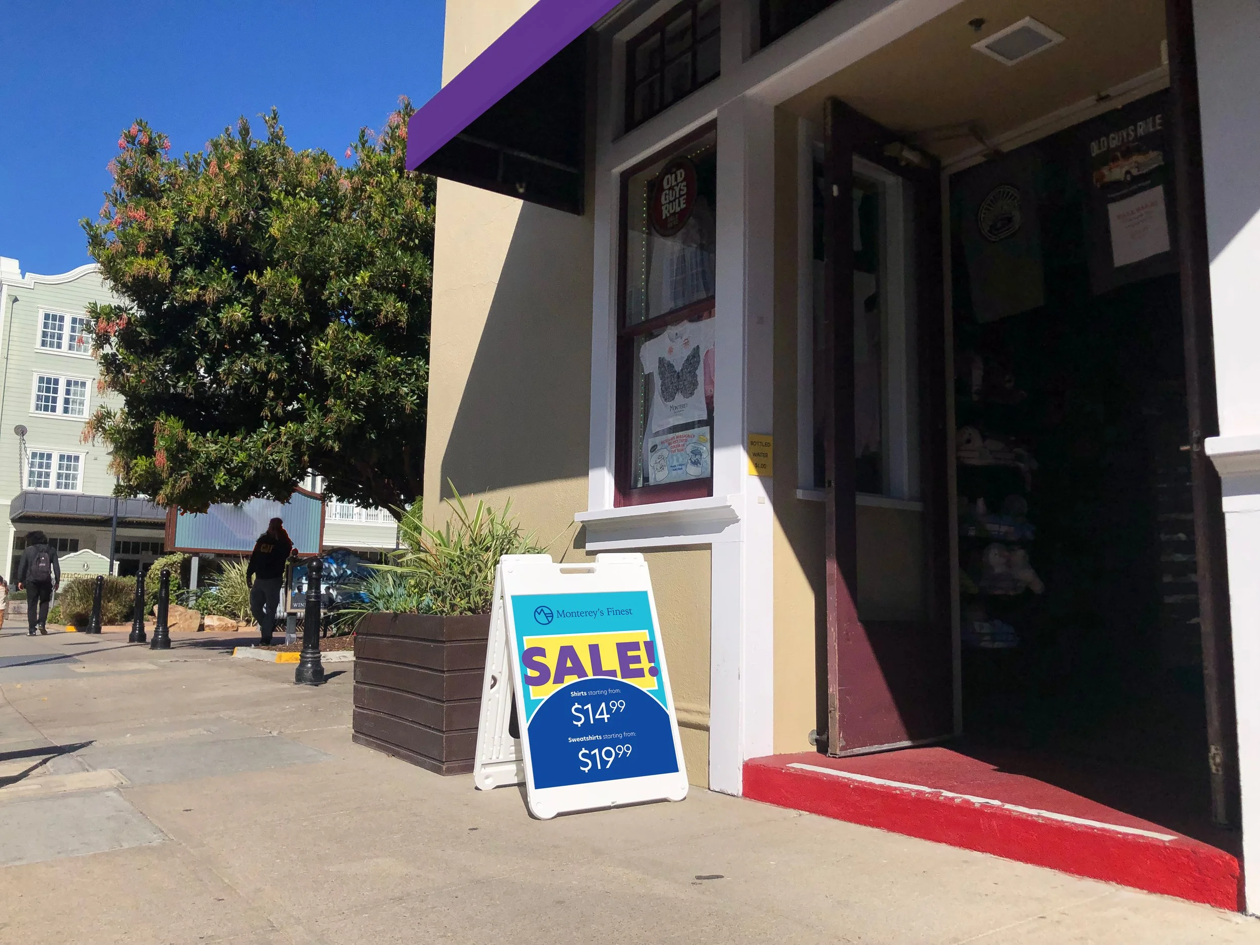
The task was to redesign Monterey’s Finest, a small gift shop, because its brand was not very well reflected through the visual identity.
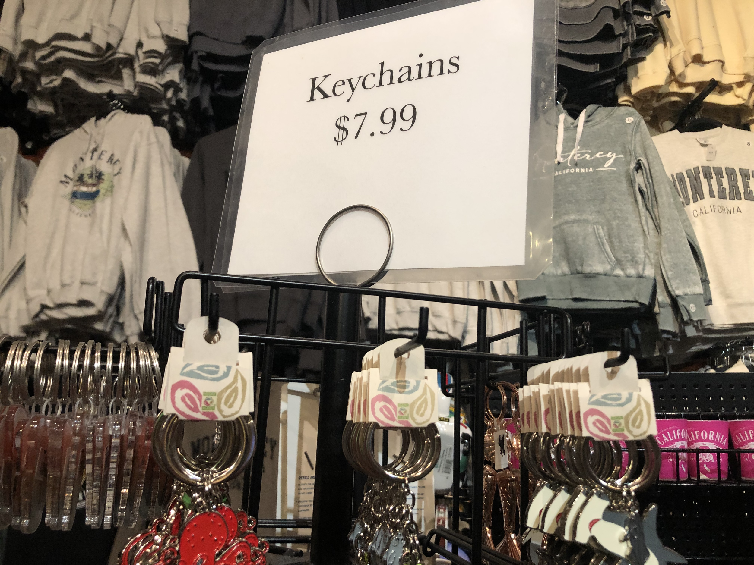
This store sells a wide variety of fun items, from shirts to shot glasses. So, it needed a fresh look that better reflects the store’s vibe, as well as giving off a modern feel as opposed to what it had.
Solution
To start off, I wanted to create a logo that would be able to connect with the main type of customers the store gets, which are families, since it is mostly the people walking out of the Monterey Bay Aquarium walking through.
Next, considering the shop is in Monterey, I wanted to incorporate some of the city’s identity in the logo, which came in the form of a mountain overlooking the ocean, created with the M and F initials. The setting also inspired my color choice, I wanted something bright, and the blues and yellows call back to the ocean and beach, while the purple is a connective color that also reflects a sunset or sunrise sky.
Finally, I decided to use shapes in the store’s design language since they call back to the logo, which is made up of straight lines and a circle. These shapes also create a simple way to navigate any signage, and remaining accessible to people from any kind of background, which is important in this area that attracts many tourists of all ages.