Festival Rebranding
Task
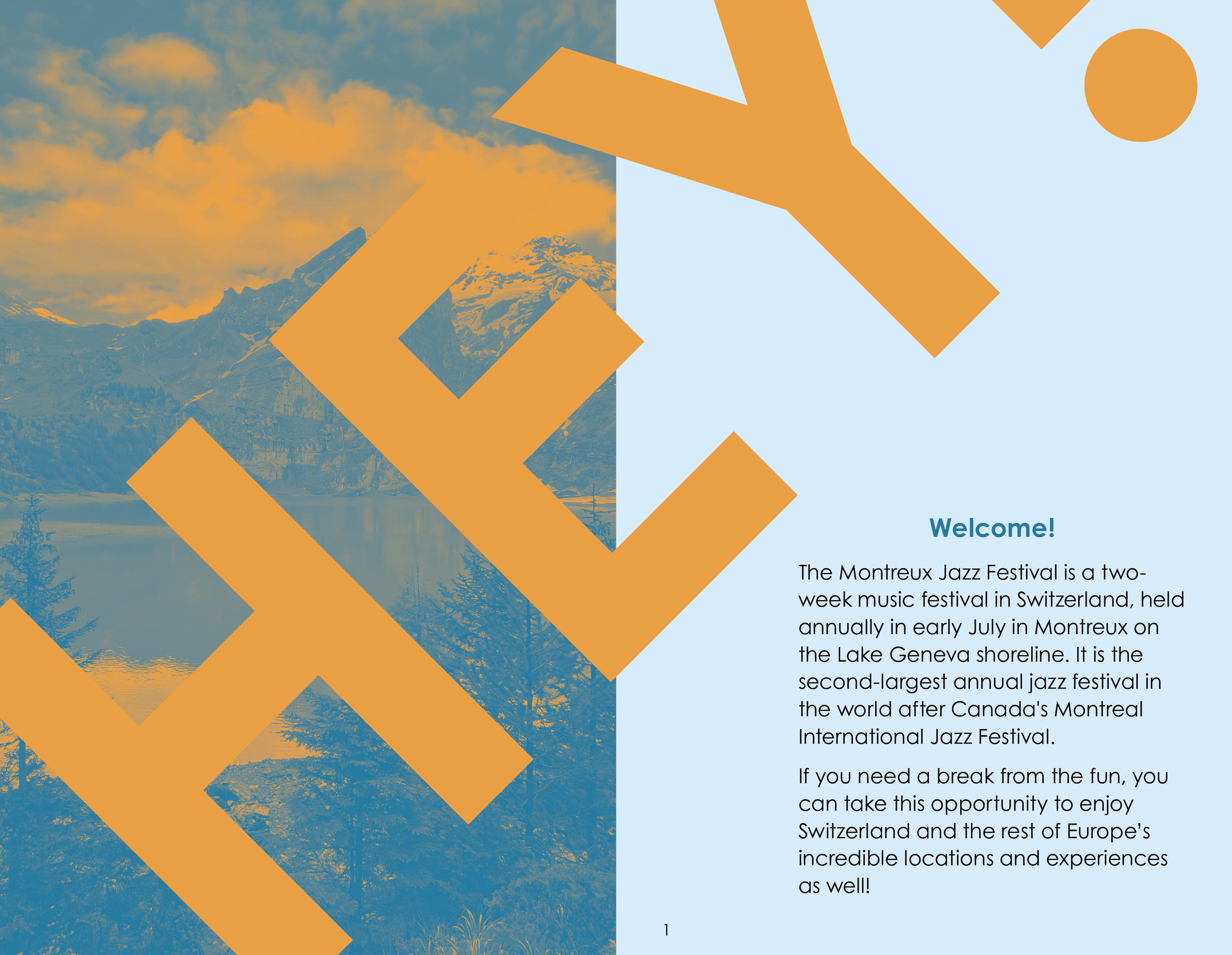
The purpose of the project was to redesign the Montreux Jazz Festival’s brand.
With the theme of “Hey!”, the executives were looking to “shake things up”.
Solution
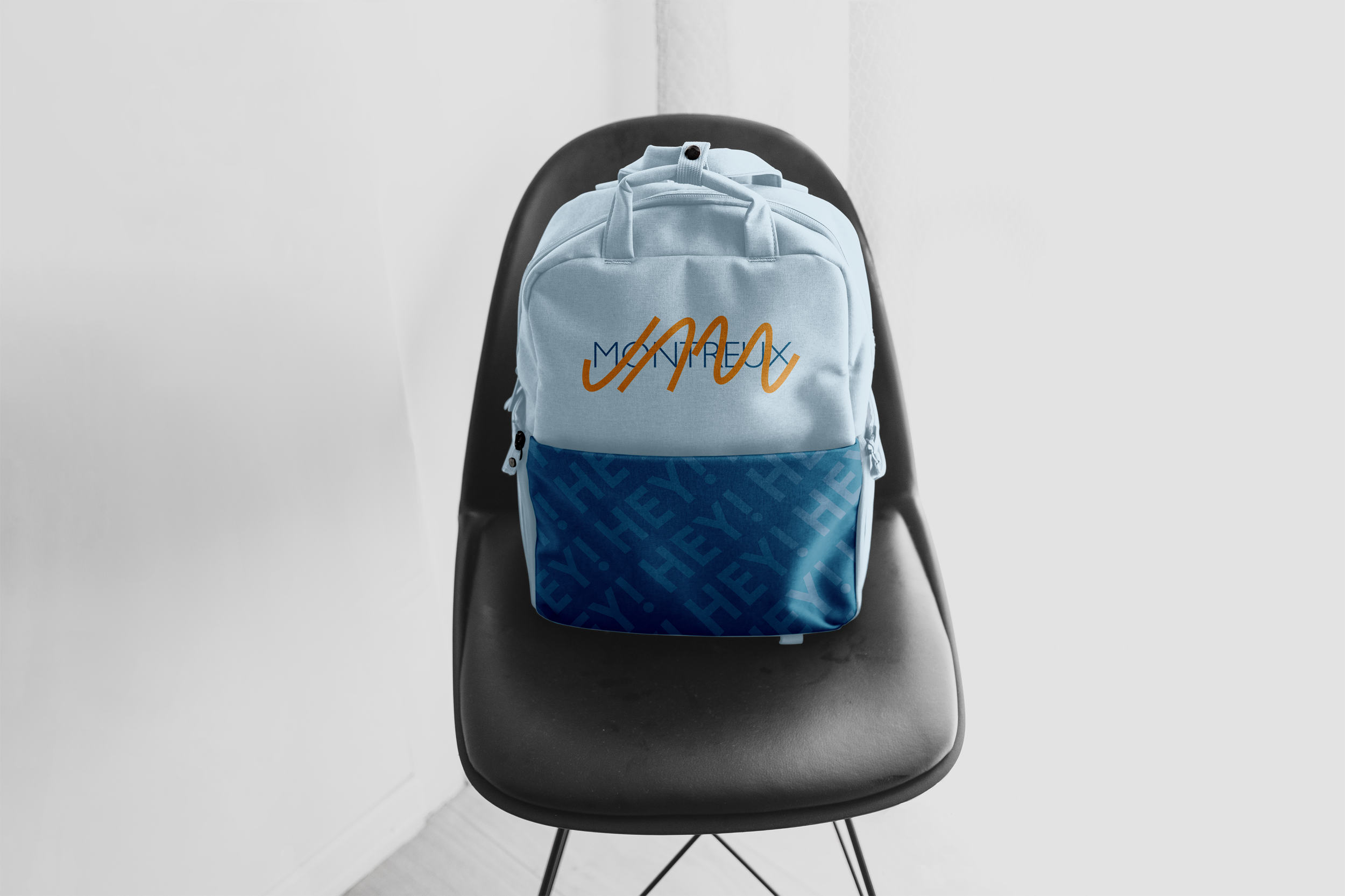
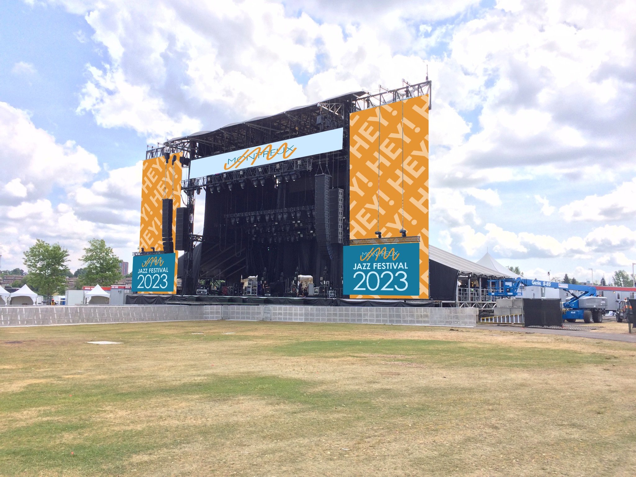
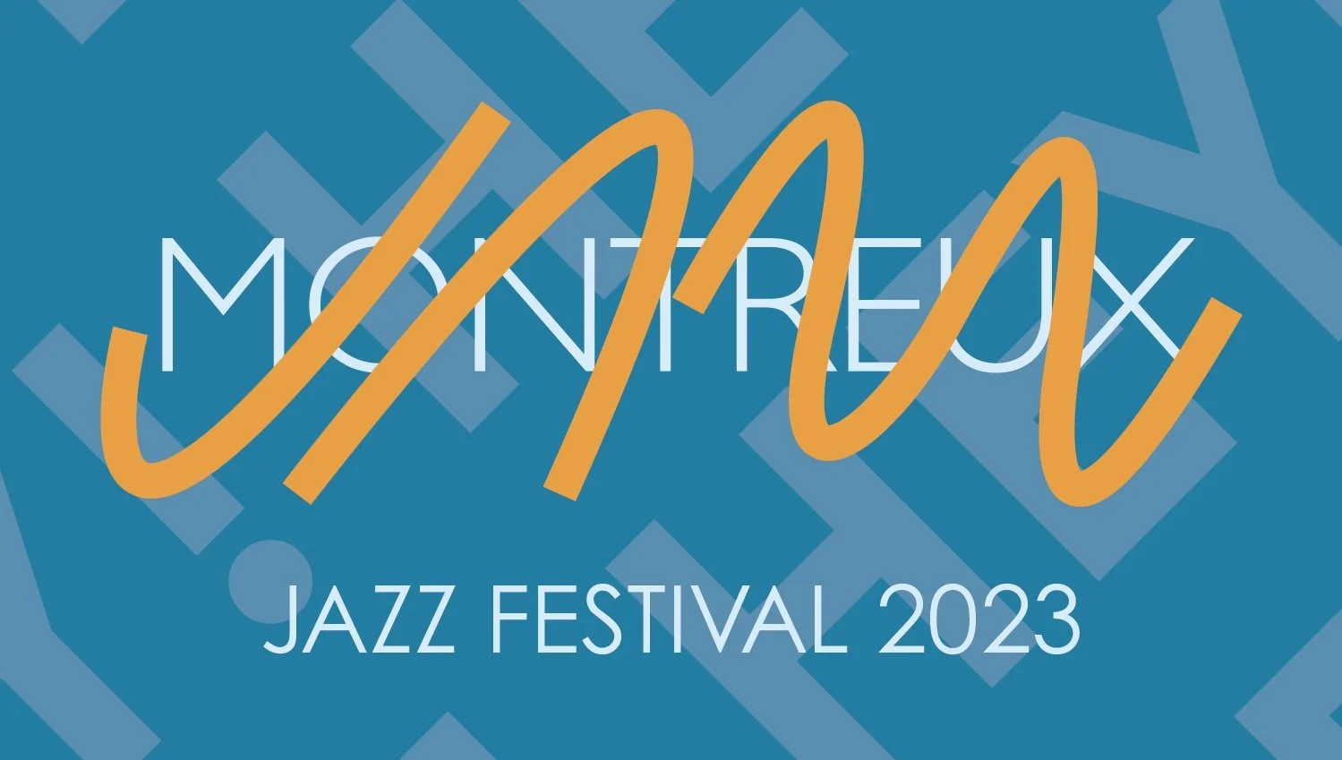
Having only these parameters to work with, I interpreted “Hey!” in the same way that a friend would call out when they see you or want to get your attention. With that in mind, I researched common visual design associated with jazz, as well as the festival’s previous identities over the years.
However, since the point of the rebranding was to “shake things up”, I decided to look into other genres’ identities, like as rock, hip-hop, alternative, etc. as well.
To me, blending ideas from different types of music is in line with the spirit of what jazz is, and I see it as a great way to evolve not just the genre, but the way the festival looks and feels.
In this rebrand, my goal was to create modern, bold visuals with design concepts from different music genres, bright colors, and a sense of dynamism.
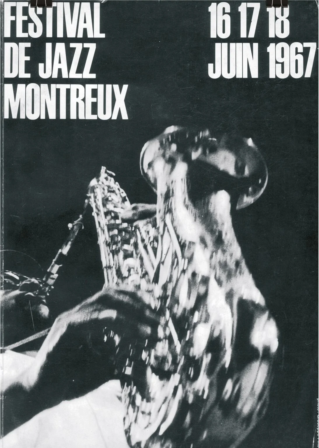
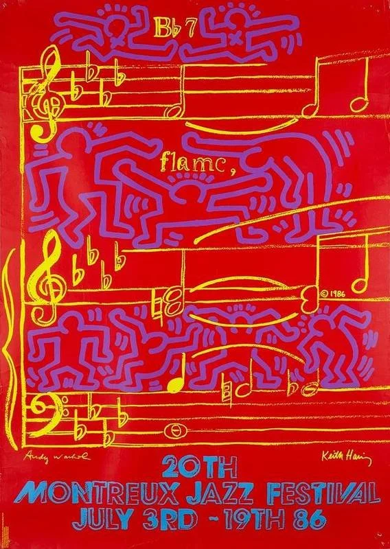
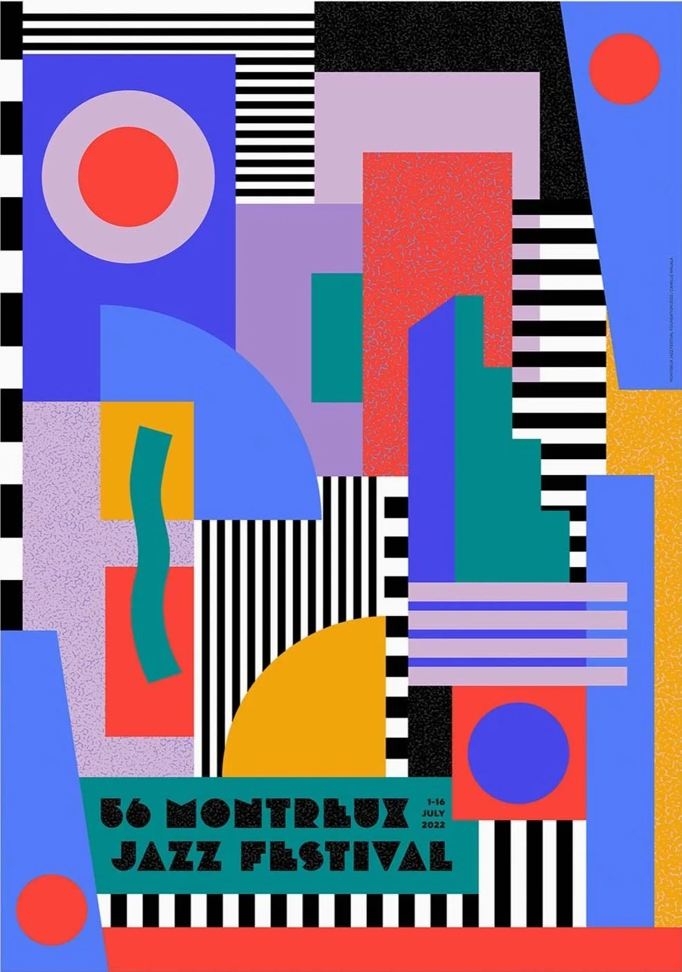
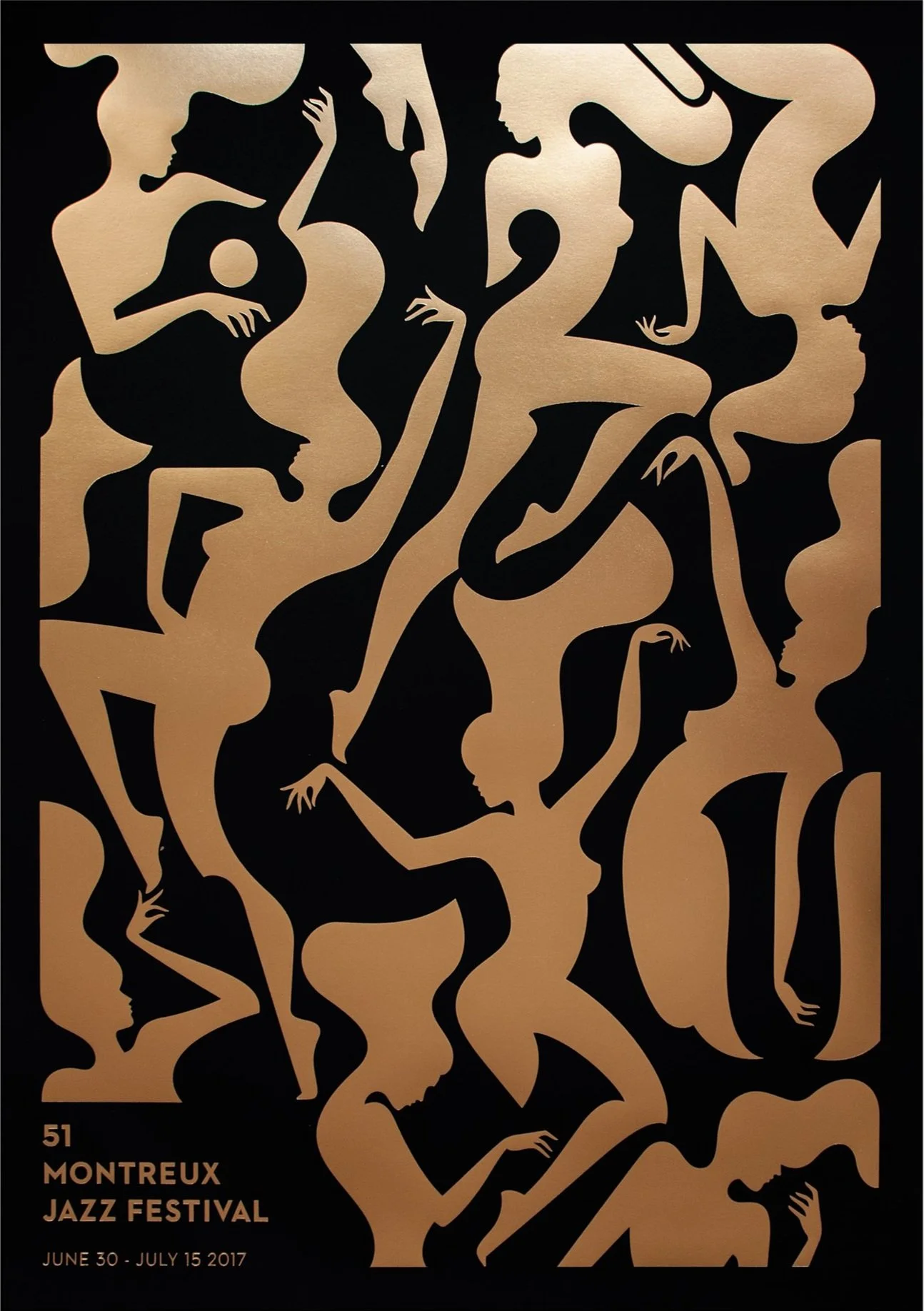
Some examples of previous visuals for the Montreux Jazz Festival.